
Over the course of watching the UCI WorldTour, I noticed cycling teams rely heavily on photo and video for social content, with few graphics created to highlight, showcase, and deliver information. This felt like a gap, one that makes it harder to follow a specific team or the WorldTour overall, especially as a newer fan to the sport. So I acted as lead art director for EF Pro Cycling and built a system consisting of templates for race content, and elevated hero graphics for big races and moments worth celebrating.
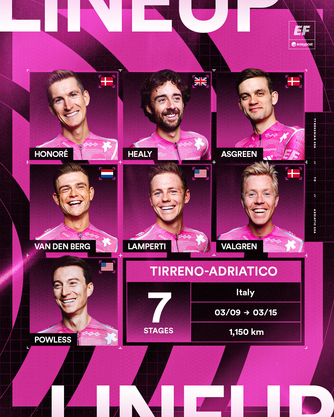
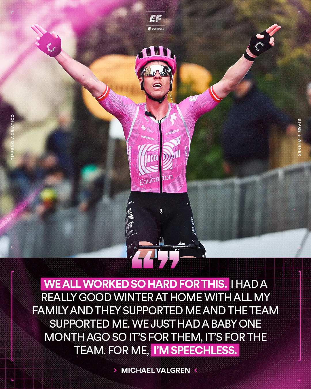
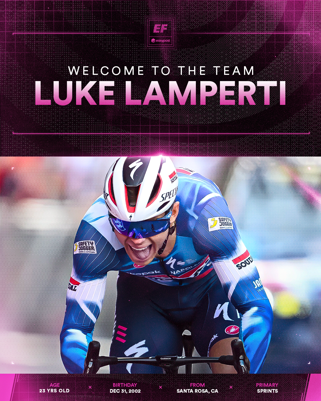
For the templates, the goal was content that felt easily digestible for casual and diehard fans alike, a way to understand a race or stage's highlights at a glance, instead of scrolling through photos and videos to piece together standings and updates. Visually, I leaned into EF Pro Cycling's and ASSOS of Switzerland's "future of speed" ethos from their recent partnership. A bold, space-age visual language built from bitmap textures echoing jersey fabric, bold pink flares, and minimal HUD-style details.
For the templates, the goal was content that felt easily digestible for casual and diehard fans alike, a way to understand a race or stage's highlights at a glance, instead of scrolling through photos and videos to piece together standings and updates. Visually, I leaned into EF Pro Cycling's and ASSOS of Switzerland's "future of speed" ethos from their recent partnership. A bold, space-age visual language built from bitmap textures echoing jersey fabric, bold pink flares, and minimal HUD-style details.







What I sought to improve upon by bringing greater brand consistency:


